So Much Coffee
I believe there are no great tools to explore the world of coffee, so I set out to make my own. I took a product management approach to designing an app that lets users find the best coffee shops, discover roasters, and navigate roasts among other tasks. After a period of research, I developed this app for my thesis in Creative Technologies & Design.
Source code available on GitHub.
Motivation & Background
As a big coffee fan, I believe that there are so many things to enjoy about coffee besides just the caffeine in each of those beans. I wanted to get more into coffee in many ways, but it can quickly get very complicated to answer basic questions. Questions like:
- Where is the closest coffee shop with great coffee?
- How can I improve the coffee I make it home?
- How do I explore the range of coffee flavors? There is no map to explore the complex world of coffee, which is why I set out to use my technical background, a product management approach, user-centered design, and an eye for detail to make loving coffee more accessible.
Problem Validation
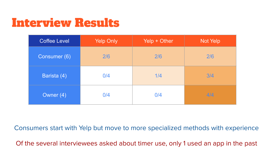
I wanted to solve many problems with my design, but I felt that a coffee timer and a shop directory would be the most achievable with my time and skills, as well as line up the best with what users were looking for. I found out through interviewing that almost everyone has their own way of finding a coffee shop, but I was almost the only person looking for a better coffee brewing timer. When I need to narrow to scope of what I was building, I knew what to do.

Navigation & User Flow
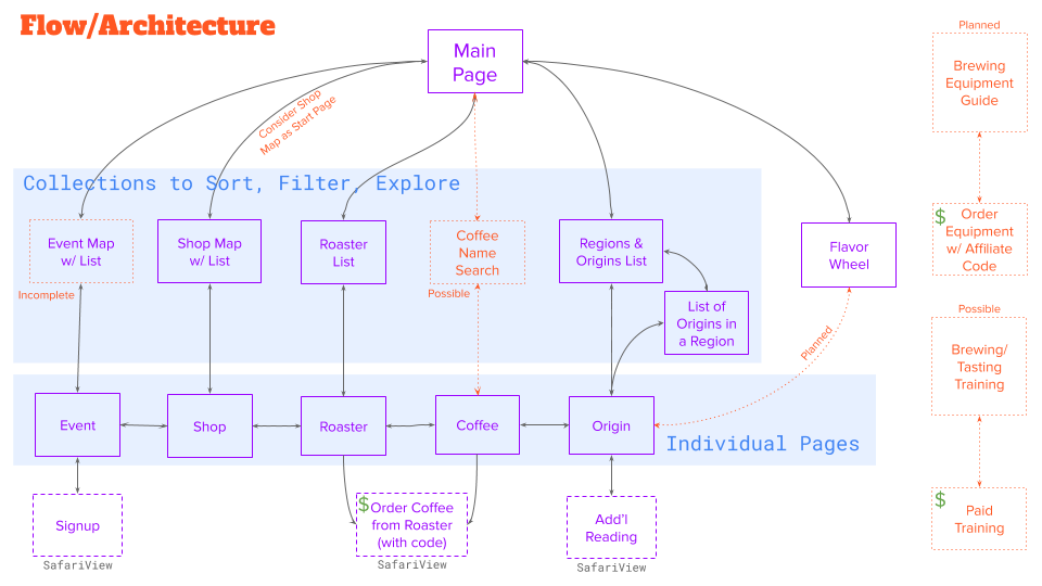
There can be as many entry points into the database as there are unique types of pages (see 1:1 vertical alignment in the middle) but some of these connections are still under development. Nonetheless, navigation between the different entities in the database allow for a long journey between shops, roasters, roasts, origins, and roasts. The graphic includes some planning ideas in orange and green.

Product Pitch
Main Pitch Deck
This is a modified version of the original product pitch I gave in my User-Centered Design class, spread across four slide decks for numerous supporting research slides.
Exemplars & Competition
Nothing is perfect, but scanning through this collection reveals almost everything that I liked and wanted to emulate.
Mediocre || Unsure
The examples in the section all had some redeeming quality to them, but didn’t provide a great experience overall.
Weak Sauce
Everything in this category was seen as being a pretty bad example of what to do or how to execute on the problem. Interestingly, one of the apps included here is a daily driver app now, so nothing is absolute.
